Recently the blog Brain Pickings wrote about the set of hand-drawn visualizations that Civil Rights activist W.E.B. Du Bois commissioned for the1900 World’s Fair in Paris. (In a previous post, Rob wrote about an art exhibit he saw that featured artistic interpretations of these plots.)

Every time I see these visualizations I am amazed—they are gorgeous and the detail (and penmanship) is amazing. The visualizations included bar charts, area plots, and maps—all hand-drawn! You can read more and see several of the data visualizations here.
My Ideal Bookshelf
This summer I read My Ideal Bookshelf, a book of hand-drawn illustrations depicting well-known cultural icons' bookshelves. Each person was asked to identify a small shelf of books that represented her/him. These could be books that “changed your life, that have made you who you are today, your favorite favorites.”
 My Ideal Bookshelf
I really enjoyed looking at the illustrations of the books, recognizing several that sat on my bookshelf. The accompanying text also told the back-story of why these books were chosen. Although this isn’t data visualization, per se (at least in the traditional sense), the hand-drawn illustrations were what drew me to the book in the first place.
Dear Data
Giorgia Lupi and Stefanie Posavec also created hand-drawn data visualizations for their Dear Data project. The project, as described on their website was:
Each week, and for a year, we collected and measured a particular type of data about our lives, used this data to make a drawing on a postcard-sized sheet of paper, and then dropped the postcard in an English “postbox” (Stefanie) or an American “mailbox” (Giorgia)!
They ultimately turned their visualizations into a book. You can learn more at their website or from the Data Stories podcast related to the project.

Mapping Manhattan
Another project, that was also turned into a book, was Mapping Manhattan: A Love (and Sometimes Hate) Story in Maps by 75 New Yorkers. Becky Cooper, the project’s creator, passed out blank maps (with return postage) of Manhattan to strangers she met walking around the city and asked them to “map their Manhattan.” (Read more here.)
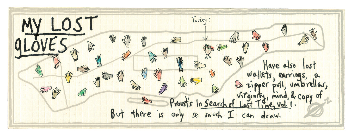 Map drawn by New Yorker staff writer Patricia Marx
The hand-drawn maps conveyed the personal story of each person’s map in a way that a computer drawn image never could. This was so compelling, we have thought about including a similar assignment in our Data Visualization course. (Although people don’t connect to Minneapolis as much as they do to New York.)
There is something simple about a hand drawn data visualization. Because of the time involved in creating a hand-drawn visualization, the creator needs to more carefully plan the execution of the final product. As should be obvious, this implies that this is not the best mode for exploratory work. However for expository work, hand drawn plots can be powerful and, I feel, connect to the viewer a bit more. (Maybe this connection is pure illusion…after all, I prefer typewritten letters to word-processed letters as well, despite never receiving either in today’s age.)
