Time zones are hard
Citizen Statistician is back from a hiatus! I hope to post more regularly in the coming weeks, including writing a post on converting from WordPress to blogdown.
I have recently been dealing with time zone changes. I’ll say a bit more about it shortly. But first, here is a picture of my 2 year old “dealing” with time zone changes.

His schedule is completely thrown off, he doesn’t know what to do with himself, so he keeps moving around in his room in his sleep. This picture also sums up my feelings about working with date/time data, especially when working across multiple time zones.
I went down this rabbit hole on a very simple sounding quest: find some weather data for two cities in the world. I use Darksky on my phone for weather (I have thoughts about whether it’s really the “most accurate source of hyperlocal weather information”1 but whatever…) so I figured I’d try the Darksky API.
Whenever I want to do anything in R, I first tell myself “there’s probably a package for that”. And this statement is true ~90% of the time. There is indeed an R package called darksky2, authored by Bob Rudis et al., that serves as an R interface to the Dark Sky API.
I’ll use three packages for this exploration:
library(darksky)
library(tidyverse)
library(lubridate)
Let’s start with getting today’s hourly data for Durham, NC. I couldn’t decide what to use as precise location in Durham without disclosing my home address, so I went with the latitude and longitude for RDU (Raleigh-Durham International Airport). There’s probably a package for looking up airport locations as well, but I just used Google for this information. Note that you need to indicate West with a minus sign.
RDU <- list(lat = 35.8801, lon = -78.7880, time = "2019-05-15T00:00:00-04:00")In the same list we also set the date/time to midnight on 15 May 2019. The time
zone is Eastern Daylight Time, which is GMT-4, indicated by the -04:00 at the
end of the time text string.
Finally, we fetch the forecast for today at RDU with darksky::get_forecast_for(). I only need the hourly forecast so I’ll exclude
daily and currently results.
rdu_forecast <- get_forecast_for(RDU$lat, RDU$lon, RDU$time, exclude = "daily,currently")Let’s take a look at the result:
as_tibble(rdu_forecast$hourly)# # A tibble: 24 x 18
# time summary icon precipIntensity precipProbabili…
# <dttm> <chr> <chr> <dbl> <dbl>
# 1 2019-05-15 05:00:00 Clear clea… 0 0
# 2 2019-05-15 06:00:00 Clear clea… 0 0
# 3 2019-05-15 07:00:00 Clear clea… 0 0
# 4 2019-05-15 08:00:00 Clear clea… 0 0
# 5 2019-05-15 09:00:00 Clear clea… 0 0
# 6 2019-05-15 10:00:00 Clear clea… 0 0
# 7 2019-05-15 11:00:00 Clear clea… 0 0
# 8 2019-05-15 12:00:00 Clear clea… 0 0
# 9 2019-05-15 13:00:00 Clear clea… 0 0
# 10 2019-05-15 14:00:00 Clear clea… 0.001 0.01
# # … with 14 more rows, and 13 more variables: temperature <dbl>,
# # apparentTemperature <dbl>, dewPoint <dbl>, humidity <dbl>,
# # pressure <dbl>, windSpeed <dbl>, windGust <dbl>, windBearing <int>,
# # cloudCover <dbl>, uvIndex <int>, visibility <dbl>, ozone <dbl>,
# # precipType <chr>And this is where I got lost for a bit. Why does the forecast start at
2019-05-15 05:00:00 instead of 2019-05-15 00:00:00?
I tried a bunch of things, and finally decided to peek at the raw JSON response
from the Darksky API by turning on the add_json argument in the get_forecast_for() function.
rdu_forecast_json <- get_forecast_for(RDU$lat, RDU$lon, RDU$time, exclude = "daily,currently", add_json = TRUE)My default method for browsing JSON files is using the viewer in RStudio, and then using the selector to help me grab an element in the file.
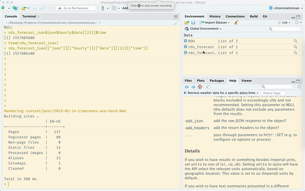
rdu_forecast_json[["json"]][["hourly"]][["data"]][[1]][["time"]]# [1] 1557892800The Darksky API mentions UNIX time (seconds since midnight GMT on 1 Jan 1970), so let’s convert it.
rdu_forecast_json[["json"]][["hourly"]][["data"]][[1]][["time"]] %>%
  as.POSIXct(origin = "1970-01-01")
# [1] "2019-05-15 05:00:00 BST"Ah, there we go! This is 05:00 British Standard Time, which is the time zone where I happen to be running this code. If so, the following should give me what I want:
rdu_forecast_json[["json"]][["hourly"]][["data"]][[1]][["time"]] %>%
  as.POSIXct(origin = "1970-01-01", tz = "America/New_York")
# [1] "2019-05-15 EDT"I think this is right, but it bugs me that I don’t see 00:00 there. Let’s try another time zone to check.
rdu_forecast_json[["json"]][["hourly"]][["data"]][[1]][["time"]] %>%
  as.POSIXct(origin = "1970-01-01", tz = "America/Los_Angeles")
# [1] "2019-05-14 21:00:00 PDT"Alright, seeing both 5am BST and 9pm PDT gives me enough to say this is indeed midnight EDT. So, if I want the hour to show up as 00:00 instead of 05:00, I should subtract 5 from the hour.
What I ultimately wanted to do was to calculate average temperature in 4 time periods during the day (night, morning, afternoon, evening) and plot them. And I’ll use the blue from the American flag for the points and lines.3
us_blue <- "#002664"

rdu_forecast$hourly %>%
  mutate(
    hour = hour(time) - 5, # because package converts to local time
    time_of_day = cut(hour, breaks = 4, labels = c("night", "morning", "afternoon", "evening"))
    ) %>%
  group_by(time_of_day) %>%
  summarize(mean_temp = mean(apparentTemperature)) %>%
  ggplot(aes(x = time_of_day, y = mean_temp)) +
    geom_line(group = 1, color = us_blue)  +
    geom_point(color = us_blue) +
    labs(x = "", y = "Mean temperature (F)",
         title = "Apparent temperature",
         subtitle = "May 15, 2019 - Durham, NC") +
    scale_y_continuous(limits = c(40, 80),
                       sec.axis = sec_axis(trans = ~(. - 32) * (5/9),
                                           name = "Mean temperature (C)"))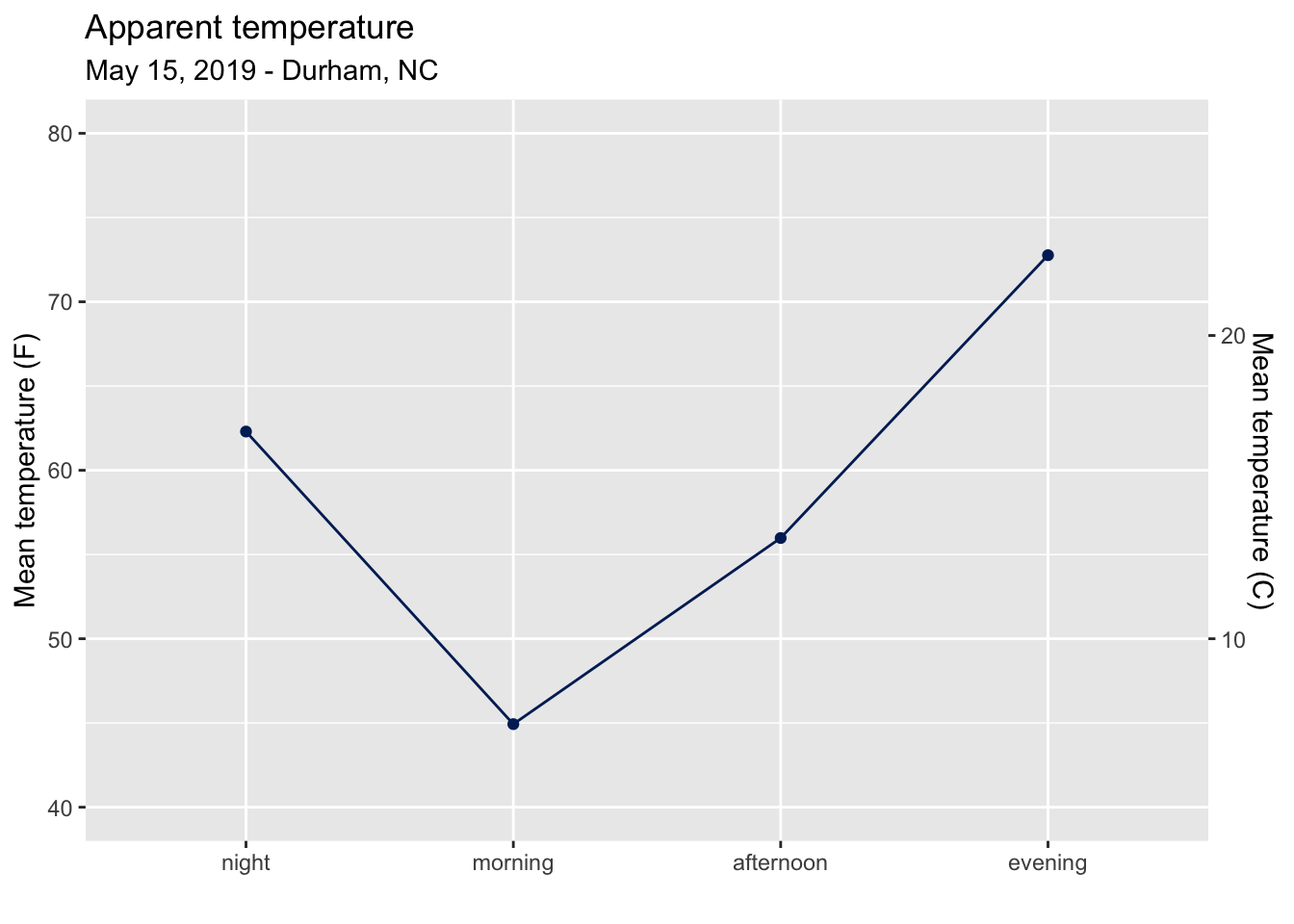
Here I split the day into four time periods with cut(), calculated mean
temperature for each time period. This information, along with information
on precipitation and humidity, is how I decide what to wear depending on what
hours of the day I’ll be out of the house.
In the visualization I’ve also used dual y-axes 😱, as I need to retrain my brain to process Celsius information quickly. I believe this is one of the accepted uses of dual axes though, since the same data is being plotted on different scales (degrees Fahrenheit vs. Celsius).
Next, let’s create a similar plot for weather in Edinburgh, Scotland. For parity, let’s go with the latitude and longitude of the airport here as well, and use the blue from the Scottish flag.4
# set location and time for EDI
EDI <- list(lat = 55.9508, lon = -3.3615,  time = "2019-05-15T00:00:00+01:00")

# get forecast
edi_forecast <- get_forecast_for(EDI$lat, EDI$lon, EDI$time, exclude = "daily,currently")

# set color
scot_blue <- "#0165BF"

# plot temperature throughout the day at EDI
edi_forecast$hourly %>%
  mutate(
    hour = hour(time),
    time_of_day = cut(hour, breaks = 4, labels = c("night", "morning", "afternoon", "evening"))
  ) %>%
  group_by(time_of_day) %>%
  summarize(mean_temp = mean(apparentTemperature)) %>%
  ggplot(aes(x = time_of_day, y = mean_temp)) +
    geom_line(group = 1, color = scot_blue) +
    geom_point(color = scot_blue) +
    labs(x = "", y = "Mean temperature (F)",
         title = "Apparent temperature",
         subtitle = "May 15, 2019 - Edinburgh, UK") +
    scale_y_continuous(limits = c(40, 80),
                       sec.axis = sec_axis(trans = ~(. - 32) * (5/9),
                                           name = "Mean temperature (C)"))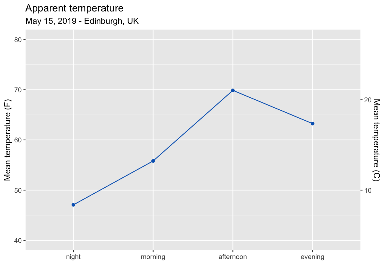
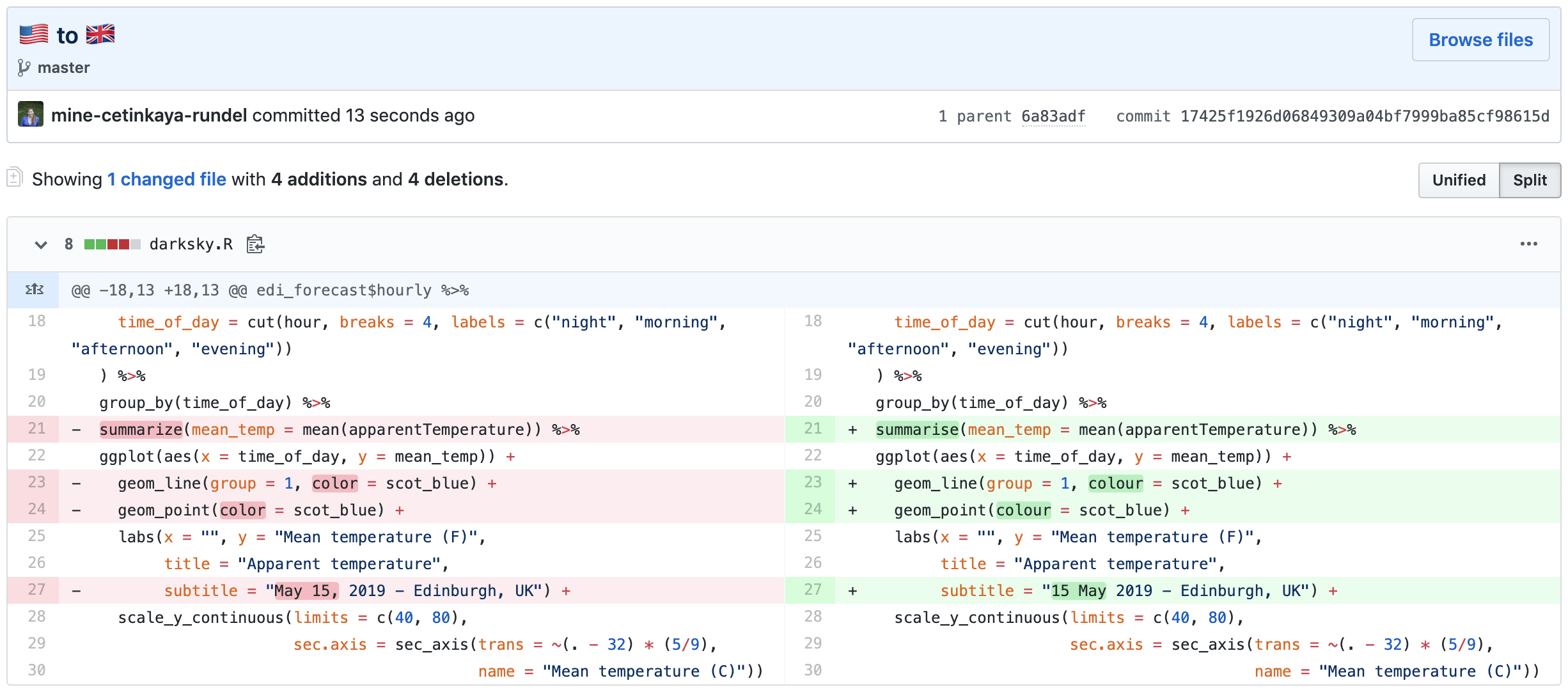
Oh, actually let me make a few more subtle changes to the code to “correct” the spelling of some of the functions and arguments.
# set colour
scot_blue <- "#0165BF"

# plot temperature throughout the day at EDI
edi_forecast$hourly %>%
  mutate(
    hour = hour(time),
    time_of_day = cut(hour, breaks = 4, labels = c("night", "morning", "afternoon", "evening"))
  ) %>%
  group_by(time_of_day) %>%
  summarise(mean_temp = mean(apparentTemperature)) %>%
  ggplot(aes(x = time_of_day, y = mean_temp)) +
    geom_line(group = 1, colour = scot_blue) +
    geom_point(colour = scot_blue) +
    labs(x = "", y = "Mean temperature (F)",
         title = "Apparent temperature",
         subtitle = "15 May 2019 - Edinburgh, UK") +
    scale_y_continuous(limits = c(40, 80),
                       sec.axis = sec_axis(trans = ~(. - 32) * (5/9),
                                           name = "Mean temperature (C)"))
And here is a better snapshot of what changed.
Weather has been lovely in Edinburgh for the last few days. I’ve also learned that this is called “taps aff” weather5, which Urban Dictionary defines as “the removing of one’s shirt or other upper body garments, most often in the event of warm weather”6).
This was an exercise in figuring out how the Darksky API works so that I can fetch some local weather data to use in my new course come September. I’ll be working on developing a lesson module around it here.
But ultimately …
I have written
this blog post
just to say
that I have
moved to
Edinburgh.
Time zones
are hard
in data science
and in real life.
So forgive me
if I haven’t responded to your email last week
I will, soon as my toddler is back on schedule…
(Also forgive me, as poetry has never been my strong suit.)
